Zara Fans Can’t Quite Handle That The Fashion Brand Has Changed Its Logo | ewmoda
 

Zara Fans Can’t Quite Handle That The Fashion Brand Has Changed Its Logo

Some people think it looks like “zaba”, which means frog in Polish.

Posted on

30 January 2019
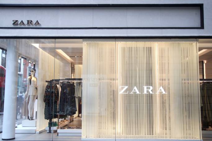
ZARA LOGO

All Credits: PA

As a species, humans admittedly aren’t that good with change. The latest example of this? Zara switched up its logo – and social media’s going a bit stir crazy over it.

It’s an unexpected move, and only the second time Zara has changed its logo in 45 years. The major difference is with the spacing – the letters no longer have gaps between them and are all bunched up together. To top off the new look, the “Z” and “R” letters have extra curves.


For a lot of people, it was the perfect time to get on PhotoShop to predict what the next iteration of the logo might look like…


A lot of people just miss simpler times, when the letters were spaced out.


For the design nerds out there, the main issue is with readability – some think when the logo is shrunk down, it looks like “Zaba”.


Even though there are a lot of people getting salty on social media, the change has won some fans.


This is by no means the first time a new logo has been met with outrage in the fashion world. Just last year fashion house Celine changed its logo in the smallest way – just by losing the accent over the “e” – and it immediately divided opinion and became subject of everything from think pieces to memes.

Zara’s logo has been done in partnership with design firm Baron & Baron – it’s not clear whether it’s a permanent change or just for the Spring/Summer 2019 campaign. According to Baron & Baron, the partnership is “an opportunity to introduce an artful new elevation to this bastion of democratic style” which will “give rise to an approach that blends elegance with edge – lifting the retailer to the level of luxury contemporaries, in a celebration of art and fashion for all.”

They’ll just have to wait out the uproar…